CSS Challenge #2: Layouting
The first challenge, was something which I was thinking about a lot these days. The next one is actually a well known common task, but it is still difficult. In every project we have different types of layouts. Of course there are some patterns. The idea today is to implement them with pure CSS.
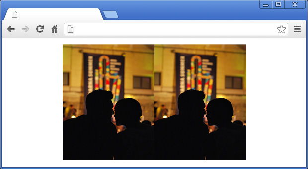
Layout A - everything centered
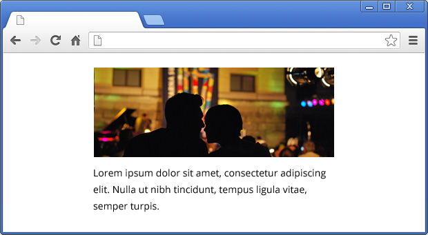
That's maybe the most simplest layout. Usually the markup is something like that:
<div class="layout-a">
    <img src="..." />
    <p>...</p>
</div>
As you know, if you have container with elements which are inline objects, you could use text-align: center to position them in the middle. If you apply this to our wrapper the image will be centered, because it is by default an inline element. Also the text in the paragraph will be centered, because the p tag inherits the text-align from its parent. However our layout is a bit different. First of all the image and the paragraph should be with equal widths. The text should be left aligned and will be nice if we could apply the same CSS with different widths of the container.
Let's imagine that we don't know the width of the image. This means that we can't also set the width of the paragraph. So, we should simply rely on the parent element. By default the p tag is a block element so its width is 100%. If we apply the same value to the tag they will be with equals widths.
Because we know the wrapper's width we could use margin: 0 auto to position it in the center. At the end we should apply text-align: left to the paragraph so its text sticks to the left. The final CSS of the layout is:
.layout-a {
    width: 360px;
    margin: 0 auto;
    text-align: center;
}
.layout-a img {
    width: 100%;
}
.layout-a p {
    text-align: left;
}
Here is a simple example to play with:
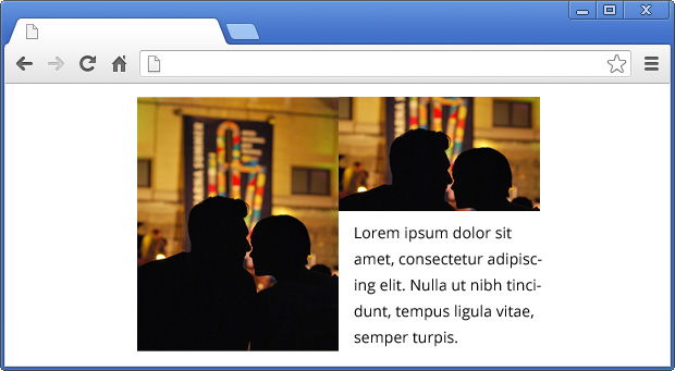
Layout B - an image and text
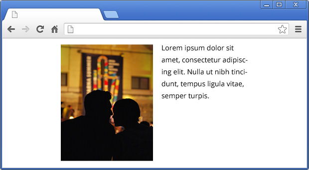
The requirements here are similar. We know only the width of the container and we should position the image on the left and the text on the right. Also the picture should expand if the wrapper has bigger width.
We should use floats here. We could apply float: left to the image, but in this case the text will go around the picture. What we want to achieve is to keep the area below the image free. Something like this:
To fix this problem we have to apply 50% width to both, the image and the paragraph. This will make two columns. And if we float them to left we are almost done.
.layout-b img {
    width: 50%;
    float: left;
}
.layout-b p {
    width: 50%;
    float: left;
}
We used floats, but we should clear them, because this will break the layout. Instead of adding more markup we may use :after pseudo class. The final CSS looks like that:
.layout-b {
    width: 360px;
    margin: 0 auto;
}
.layout-b:after {
    content: "";
    display: block;
    clear: both;
}
.layout-b img {
    width: 50%;
    float: left;
}
.layout-b p {
    width: 50%;
    float: left;
    margin: 0;
    padding: 0 0 0 10px;
    -webkit-box-sizing: border-box;
    -moz-box-sizing: border-box;
    box-sizing: border-box;
}
Notice that I used a little padding in the paragraph styling. Because of that I needed to apply box-sizing: border-box. Otherwise those 10px will move the text below the image.
Working example:
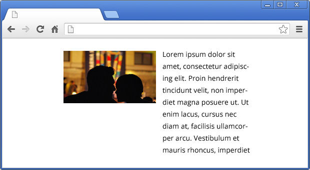
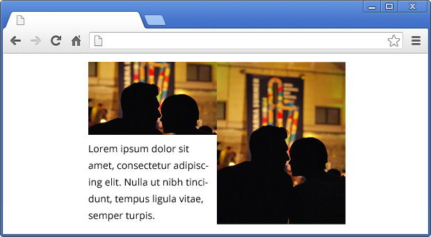
If you want to have the text on the left and the image on the right then you could just switch the places of the tags in the container. Also you should update the padding of the paragraph, so its padding-right property contains 10px.
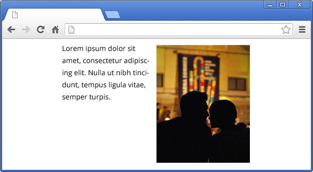
Of course instead of text you could use another image. They both will take exactly 50% of the wrapper.
Layout C - a bit complex
Two images and little text. It's almost like the previous layout, but we need more markup.
<div class="layout-c">
    <img src="..." />
    <div class="layout-c-right">
        <img src="..." />
        <p>...</p>
    </div>
</div>
As you may guess, we still have two columns, but this time there is a conflict. If we apply width: 50%; float: left; to the tag it will be valid for the image inside the nested container .layout-c-right. That's why we should overwrite this style and the layout's CSS transforms to:
.layout-c {
    width: 360px;
    margin: 0 auto;
}
.layout-c:after {
    content: "";
    display: block;
    clear: both;
}
.layout-c img {
    width: 50%;
    float: left;
}
.layout-c-right {
    float: left;
    width: 50%;
}
.layout-c-right img {
    width: 100%;
    float: none;
}
.layout-c p {
    margin: 0;
    padding: 5px 0 0 10px;
    -webkit-box-sizing: border-box;
    -moz-box-sizing: border-box;
    box-sizing: border-box;
}
The result is exactly what we wanted:
Same like in layout B, if you want to switch the positions of the columns you just have to change their order in the DOM. And of course update the padding of the paragraph.
Layout D - many columns and space between them
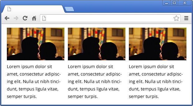
It's not that simple as it looks like. Of course, we will use floats, so we should keep the clearing. In our case we have three columns, so every of them have to take exactly 33.33% of the whole width. The markup that we are using is:
<div class="layout-d">
    <div class="layout-d-column">
        <img src="..." />
        <p>...</p>
    </div>
    <div class="layout-d-column">
        <img src="..." />
        <p>...</p>
    </div>
    <div class="layout-d-column">
        <img src="..." />
        <p>...</p>
    </div>
</div>
There should be some space between the columns. By using padding and box-sizing we could achieve this:
.layout-d-column {
    width: 33.33%;
    float: left;
    padding: 0 20px 0 0;
    -webkit-box-sizing: border-box;
    -moz-box-sizing: border-box;
    box-sizing: border-box;
}
If you try the things so far you will notice that the third column is not positioned to the very right side of the wrapper. That's because those 20px padding. Hopefully there is a way to fix that. And again with pure CSS. The idea is to play with the paddings like that so the columns have equal widths. Here is the final result:
.layout-d {
    width: 500px;
    margin: 0 auto;
    border: solid 1px #000;
}
.layout-d:after {
    content: "";
    display: block;
    clear: both;
}
.layout-d-column {
    width: 33.33%;
    float: left;
    padding: 0 5px 0 5px;
    -webkit-box-sizing: border-box;
    -moz-box-sizing: border-box;
    box-sizing: border-box;
}
.layout-d-column:last-child {
    padding: 0 0 0 10px;
}
.layout-d-column:first-child {
    padding: 0 10px 0 0;
}
.layout-d-column img {
    width: 100%;
}
.layout-d-column p {
    padding: 10px 0 0 0;
    margin: 0;
}
The layout solution works with more columns as well. What you have to do is to update the width of .layout-d-column. For example the preview below uses 25%:
 With over two decades of deep programming expertise, I offer comprehensive web consultancy and stack audits, alongside specialized workshops, training, and engaging public speaking to elevate your team's skills and optimize your digital presence. Contact me.