CSS: :before and :after pseudo elements in practice
By definition :before and :after are CSS pseudo elements. You can use them to insert something before or after the content of an element. There are some great articles giving the basics, but I wanted to write down a blog post for the real use cases. Or, at least, to show what I'm using them for.
Syntax
Let's say that we have the following simple html markup:
<p>paragraph text</p>
We are able to use a pseudo element like that:
p:before {
    content: "this is ";
    font-weight: bold;
    font-style: italic;
}
And the result is:
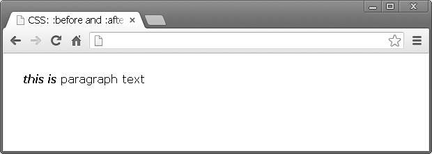
Have in mind that you are actually adding an element before or after the content. It's not something which appear next to the selected element, but it is related to its content.
Icons
It is very popular to use :before or :after for displaying an icon. Because you are able to add every CSS style property, you could make the newly created element a block one and attach background image.
Again, we have the same markup <p>paragraph text</p> and the following CSS:
p:before {
    content: "";
    display: block;
    background: url("icon.jpg") no-repeat;
    width: 20px;
    height: 20px;
    float: left;
    margin: 0 6px 0 0;
}
icon.jpg is a 20x20 image exported from Photoshop. Here is how this looks in a browser:
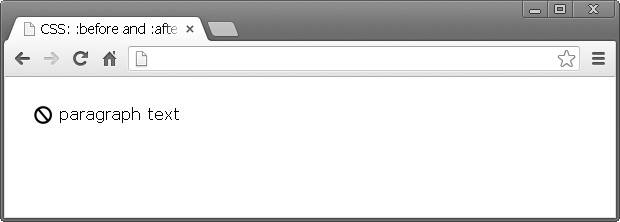
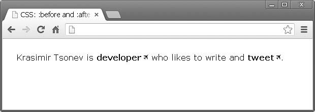
Styling external links
I saw this in a good amount of products. It is a good practice to style differently the links which point to external resources. This could be easily done with the technique above. Let's say we have the following paragraph of text:
<p>
    Krasimir Tsonev is <a href="http://krasimirtsonev.com">developer</a>
who likes to write and <a href="https://twitter.com/KrasimirTsonev">tweet</a>.
</p>
We could add a small icon after that link indicating that it points to page outside the current domain.
a {
    text-decoration: none;
    font-weight: bold;
    color: #000;
}
a:after {
    content: "";
    display: inline-block;
    background: url("icon-external.jpg") no-repeat top right;
    width: 14px;
    height: 12px;
}
Breadcrumbs (navigation)
Usually when you do breadcrumbs you have links and separator between them. Instead of adding an element into the DOM you could achieve the same effect with pure css.
The HTML:
<p>
    <a href="#">Home</a>
    <a href="#">Team</a>
    <a href="#">Developers</a>
</p>
Just a few lines of CSS:
a {
    text-decoration: none;
    font-weight: bold;
    color: #000;
}
a:after {
    content: " /";
}
a:first-child:before {
    content: " » ";
}
a:last-child:after {
    content: "";
}
And the result is this:
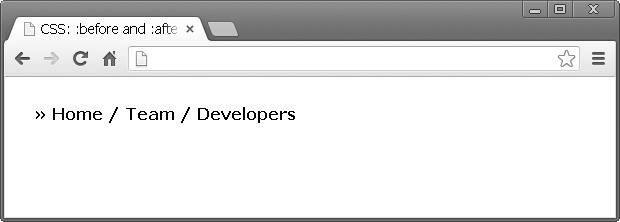
There are few interesting things happening. Firstly, there is a bullet before all the links. I combined two pseudo elements first-child and before saying "Add » before the first link". At the end I did the same thing to remove the separator from the last link in the list.
I found this extremely helpful. Mainly because I don't have to take care about this in the code which generates the navigation. I mean if I have to build the same thing with PHP I should write some additional code. For example:
$links = array('Home', 'Team', 'Developers');
$str = '» ';
for($i=0; $i';
    if($i < count($links)-1) {
        $str .= ' / ';
    }
}
echo $str;
I.e. in the code above I added the bullet in front of the links and some logic for the separators inside PHP. That's somehow wrong, because the PHP code should not be responsible for the look of the things.
Clearing floats
Using float property is still quite popular. It helps a lot for layout organization. However, once an element is floated you need another element to clear the float. Otherwise the result is not so good. For example the following code:
// html
<a href="#">Home</a>
<a href="#">Products</a>
<p>Lorem ipsum dolor sit amet, consectetur adipiscing elit. Donec at purus ac lacus ultrices vehicula.</p>

// css
a {
    float: left;
    display: block;
    width: 100px;
    ... other styling
}
Will produce the following layout:
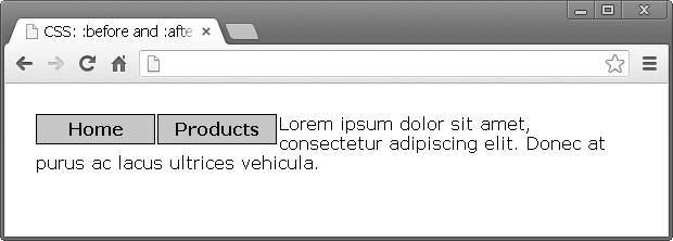
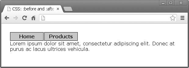
The text should be below the links and instead of adding new DOM node you can use :before pseudo element to clear the float:
p:before {
    content: "";
    display: block;
    clear: both;
}
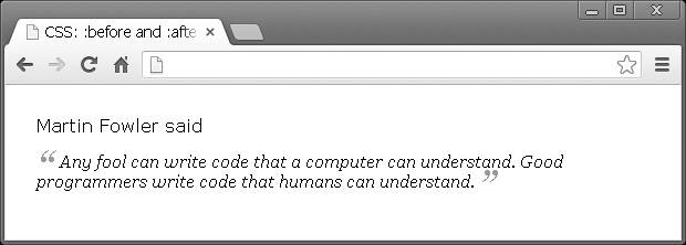
Quoting
:before and :after are perfect for quoting text. Let's say that we have a smart thought and we want to format it.
<p>
    Martin Fowler said
    <span class="quoted">Any fool can write code that a computer can understand.
    Good programmers write code that humans can understand.</span>
</p>
The following effect could be achieved only with CSS:
span.quoted {
    font-family: Georgia;
    font-size: 16px;
    display: block;
    margin: 14px 0 0 0;
    font-style: italic;
}
span.quoted:before {
    content: "“";
    font-size: 40px;
    color: #999;
    line-height: 0;
    display: inline-block;
    margin: 0 6px 0 0;
}
span.quoted:after {
    content: " ”";
    font-size: 40px;
    color: #999;
    line-height: 0;
    display: inline-block;
    margin: 0 0 0 4px;
}
Arrows
You know those little things which the designers add to the popups or the nicely looking tooltips. It's kinda tricky to code them. Luckily you are able to solve the problem in your CSS file. No additional images or hacky JavaScript. Here is what I'm talking about.
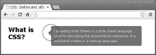
As a starting point our markup looks like that:
<h2>What is CSS?</h2>
<div class="popup">
    Cascading Style Sheets is a style sheet language used for describing
    the presentation semantics of a document written in a markup language.
</div>
So, we have a title on the left and popup on the right. We need to add this little arrow on the left side of the description text, pointing to the title. Chris Coyier explains how to make an arrow with simply border styling. We can use that and append such an element to our popup.
h2 {
    float: left;
    width: 170px;
}
.popup {
    float: left;
    width: 340px;
    background: #727272;
    padding: 10px;
    border-radius: 6px;
    color: #FFF;
    position: relative;
    font-size: 12px;
    line-height: 20px;
}
.popup:before {
    content: "";
    display: block;
    width: 0;
    height: 0;
    border-top: 12px solid transparent;
    border-bottom: 12px solid transparent;
    border-right: 12px solid #727272;
    position: absolute;
    top: 16px;
    left: -12px;
}
Styling titles
Currently I'm working on a project which is an one-page site. There are titles which devide the different sections. Every title is wrapped by two lines. Here is how the final design looks like:
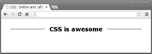
Again really simple usage of :before and :after:
h2 {
    width: 100%;
    margin: 0;
    padding: 0;
    text-align: center;
}
h2:after {
    display: inline-block;
    margin: 0 0 8px 20px;
    height: 3px;
    content: " ";
    text-shadow: none;
    background-color: #999;
    width: 140px;
}
h2:before {
    display: inline-block;
    margin: 0 20px 8px 0;
    height: 3px;
    content: " ";
    text-shadow: none;
    background-color: #999;
    width: 140px;
}
Conclusion
The most important benefit of pseudo :after and :before elements is that you are able style your HTML without to add new DOM nodes. I really like to read clean and semantic markup. CSS is the place for all the visual things and it is great that we have such an instrument.
Examples
All the examples used in this article are available in this repository.
Resources
 With over two decades of deep programming expertise, I offer comprehensive web consultancy and stack audits, alongside specialized workshops, training, and engaging public speaking to elevate your team's skills and optimize your digital presence. Contact me.