CSS Challenge #1: expand and center an image
That's first of (I hope) many posts with such an idea. Problems solved with pure CSS. No JavaScript.
I'm working on a gallery typed site and I need to show photos. Of course, most of the things are unknown, but everything should look really cool.
The following sketch illustrates the situation:
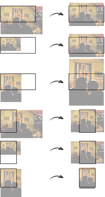
I.e. I have a div, wrapper which contains an image tag. The picture should expand and fill the parent element. Together with that it should be centered vertically/horizontally. The size of the image and the container could vary.
<div class="wrapper">
    <img src="pic.jpg" />
</div>
Let's say that the wrapper has the following CSS applied:
.wrapper {
    width: 400px;
    height: 200px;
    overflow: hidden;
}
As I said, the dimensions of the container are unknown. The solution should work even with 200x400. And remember, I can't use JavaScript to get the size of the image, make calculations or change CSS properties.
What I tried and it didn't work
The very first thing, which I did was to apply max-width: 100% to the image tag. The photo was successfully resized to exactly 400px by width. The problem was that it wasn't centered and, more importantly, if the image was small and its width was less then 400px there was some unfilled space. So, I replaced max-width with simply width. This guaranteed that the image will be resized to exactly 400px no matter what. The first step was made and I thought that I was in the right direction.
The next thing, which I had to fight with was the centering. I tried several variants - negative margin or padding, absolution positioning or usage of percentages. Non of these things worked. It looked that it is not possible to cover all the cases without using JavaScript.
Even if the above problem is solved that will be only 50% of the job, because if the width of the wrapper is less then its height everything starts from the beginning. So, I wasn't able to figure out how to make the things in the CSS styling. I had to change the markup and try again.
The solution
During the development of krasimirtsonev.com I used background-size: cover. What it does is to resize your background image like that so it fills all the available space. So, the first thing which I did is to set the image as a background of the wrapper.
<div class="wrapper" style="background-image: url('pic1.jpg');"></div>
Yes, I know that inline styling is not a good idea. Also the missing of img tag means that search engines will not parse very well my images. Anyway, the type of the project allows those sacrifices.
After that I added background-size: cover to the wrapper's styles:
.wrapper {
    width: 400px;
    height: 200px;
    overflow: hidden;
    background-size: cover;
}
Only this property solves half of the problem. After that the resizing of the image matched my criterias.
Another useful property is background-position. I added background-position: center center and voila - mission completed.
The final code looks like that
// html
<div class="wrapper" style="background-image: url('pic1.jpg');"></div>

// css
.wrapperA {
    width: 400px;
    height: 200px;
    overflow: hidden;
    background-size: cover;
    background-position: center center;
}
Here is a jsfiddle showing the result:
 With over two decades of deep programming expertise, I offer comprehensive web consultancy and stack audits, alongside specialized workshops, training, and engaging public speaking to elevate your team's skills and optimize your digital presence. Contact me.